

Build a carousel
Add horizontal browsing, thumbnails, autoplay, and an optional lightbox.
Use PhotoCarousel when horizontal browsing is part of the design. Its
lightbox is disabled by default.
Configure the carousel
Change the small library-owned option surface.
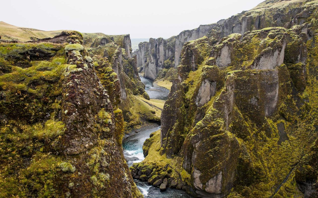
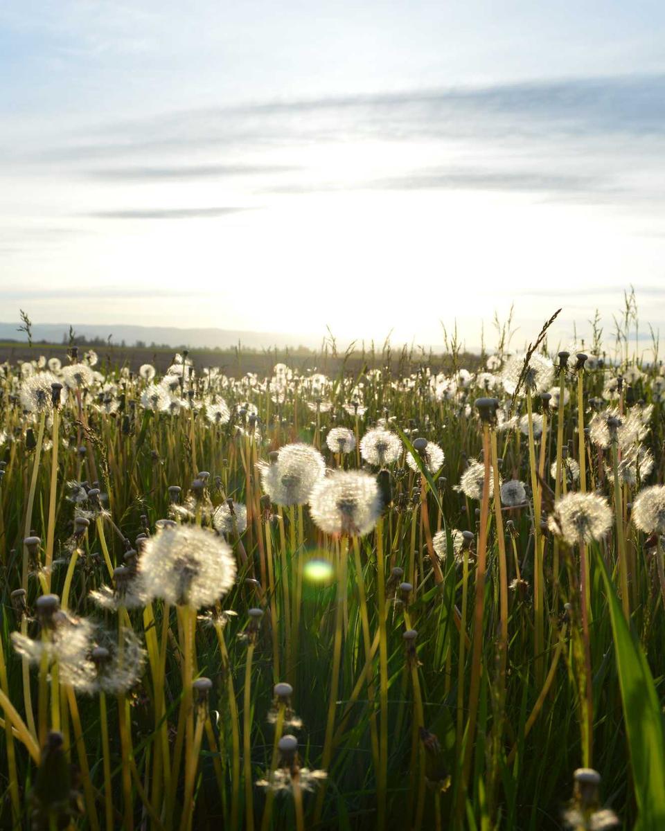



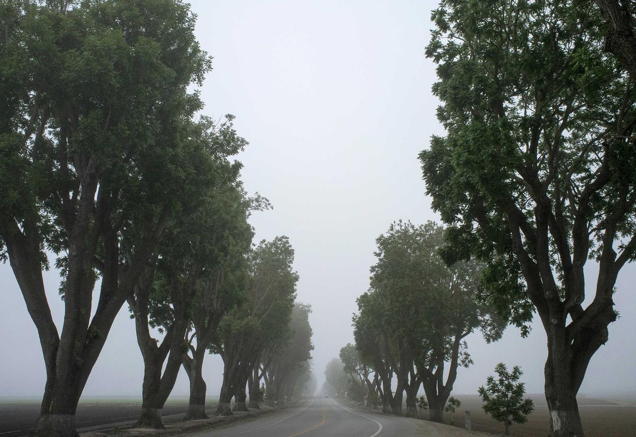

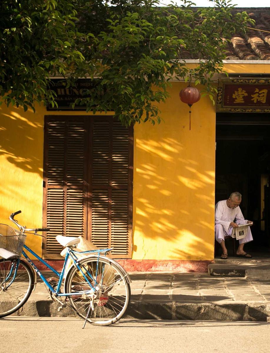
<PhotoCarousel
  :photos="photos"
  :loop="true"
  :drag-free="false"
  :autoplay="false"
  :show-thumbnails="true"
  :show-dots="false"
  :lightbox="true"
  direction="ltr"
/><script setup lang="ts">
import type { PhotoItem } from '@lupinum/nuxt-photo/app'
const photos: PhotoItem[] = [
{ id: 'coast', src: '/photos/coast.jpg', width: 1200, height: 800, alt: 'Coastline' },
{ id: 'forest', src: '/photos/forest.jpg', width: 1200, height: 800, alt: 'Forest' },
]
</script>
<template>
<PhotoCarousel :photos="photos" slide-aspect="16/9" :lightbox="true" />
</template>The result has arrows, a counter, and thumbnails. Selecting a slide opens the
lightbox because the example opts in with :lightbox="true".
Add autoplay deliberately
<PhotoCarousel
  :photos="photos"
  :autoplay="{
    delayMs: 4500,
    stopOnInteraction: true,
    stopOnMouseEnter: true,
  }"
/>
The defaults are 4000 ms, stop after interaction, and continue on mouse enter. Set all three fields when product behavior must remain clear during later edits.
Show more than one slide
<PhotoCarousel :photos="photos" slide-size="70%" gap="12px" />Each slide remains one snap. slideSize changes the visible width, not the
number of slides scrolled per navigation action.
Support right-to-left pages
Omit direction when document direction is stable at mount. Bind it when locale
direction can change without remounting:
<PhotoCarousel :photos="photos" :direction="localeDirection" />The main and thumbnail rails receive the same direction. Verify dragging, arrows, keyboard navigation, and thumbnail selection in both directions.
PhotoCarousel reference lists every prop, event, and slot.