
Customization levels
Choose the smallest public customization surface that fits the design.
Start with ready-made components. Move to lower-level components only when a specific design cannot be expressed with props, CSS, or slots.
Choose the shallowest customization layer
More control also means more markup and accessibility ownership.
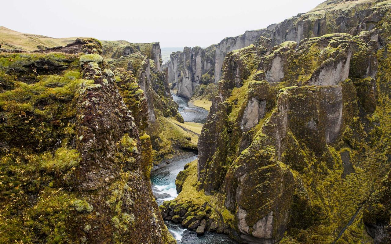
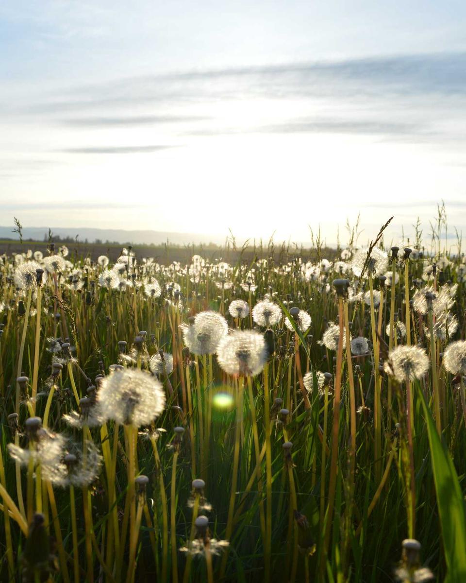

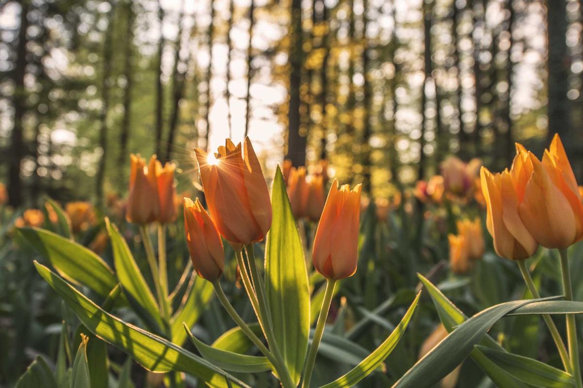

Ready-madeLayout, triggers, lightbox, gestures
<PhotoAlbum :photos="photos" layout="rows" />Choose a level
| Level | Public surface | Use it for |
|---|---|---|
| 1 | Component options and CSS variables | Layout, spacing, colors, and common behavior. |
| 2 | Slots | Custom thumbnail, caption, action, or slide UI. |
| 3 | PhotoTrigger and LightboxProvider | A custom thumbnail layout with the lightbox. |
| 4 | provideLightbox and primitives | A fully custom lightbox interface. |
| 5 | Image and lightbox injection keys | Application-wide service or component changes. |
Use only the level that owns the needed behavior. A custom thumbnail does not require a custom lightbox. A custom action button does not require a new provider.
Application-wide overrides
Nuxt applications import these public symbols from
@lupinum/nuxt-photo/app:
PhotoDefaultsKeysets shared labels and lightbox defaults.ImageAdapterKeyprovides a default image adapter.LightboxComponentKeyreplaces the ready-made lightbox used by components.
An override lightbox consumes the existing provider. Do not call
provideLightbox() inside it unless you intend to create a separate state
owner.
Use Customize the built-in lightbox before building from primitives.